Mealtrac | Calorie Tracking Mobile App | UX / Ideation / Prototyping / Research | 2024
Mealtrac | Calorie Tracking Mobile App
UX, Ideation, Prototyping, Research | 2024
MealTrac is an app that helps individuals accurately track and manage their dietary intake.
MealTrac is an app that helps individuals accurately track and manage their dietary intake.
Future = Healthy Living
Healthy living has been identified as one of the 8 mega trends through 2030 by Euromonitor International and wearable technologies such as fitness apps, activity trackers, or smart watches are supposed to support consumers in their aspirations towards a healthy lifestyle.
Future = Healthy Living
Healthy living has been identified as one of the 8 mega trends through 2030 by Euromonitor International and wearable technologies such as fitness apps, activity trackers, or smart watches are supposed to support consumers in their aspirations towards a healthy lifestyle.
Healthy Living = Mealtrac
Mealtrac is a tool I developed to address the challenges faced by users of current calorie-tracking applications. This UX journey involved a comprehensive understanding of users and their problems through primary and secondary research. The process included ideating creative solutions, preparing wireframes, and user flows for the potential solution, and ultimately building a working prototype of the proposed solution.
[1]
Visuals > Words
Based on user testing, 80% found progress tracking compelling.Observing that many existing products lack visual metrics, I leveraged an intuitive UI to display progress through percentages, pie charts, line graphs, and progress bars would.
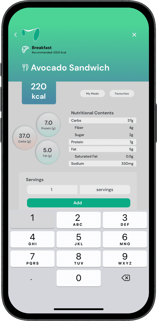
The illustrations would make it easier for users to track their progress and differentiate our product from competitorsThe UI highlights key information on the nutritional content screen, enabling users to quickly grasp essential details such as total calories, food name, protein, carb, and fat contents, along with an add button.
[1] Visuals > Words
Based on user testing, 80% found progress tracking compelling.Observing that many existing products lack visual metrics, I leveraged an intuitive UI to display progress through percentages, pie charts, line graphs, and progress bars would.
The illustrations would make it easier for users to track their progress and differentiate our product from competitorsThe UI highlights key information on the nutritional content screen, enabling users to quickly grasp essential details such as total calories, food name, protein, carb, and fat contents, along with an add button.


[2]
Stricter Tracking
Based on user testing, all participants favoured stricter app-set deadlines.I structured the onboarding questions to establish clear quantitative goals: a 3-month timeframe with a specific weight change target and precise daily calorie requirements.To address competition's lack of tracking metrics, I designed a calendar which displays daily progress. The feature provide users with an accessible and consistent progress report.
[2] Stricter Tracking
Based on user testing, all participants favoured stricter app-set deadlines.I structured the onboarding questions to establish clear quantitative goals: a 3-month timeframe with a specific weight change target and precise daily calorie requirements.To address competition's lack of tracking metrics, I designed a calendar which displays daily progress. The feature provide users with an accessible and consistent progress report.


[3]
Intuitive UI
Based on user testing, 60% of participants prioritize a simple and intuitive UI.To address this, I implemented grids, distinct icons and colours for each meal, a consistent nutritional information structure, and options to increase servings and save favourite meals. I also ensured key information, such as calorie counts and meal names, was prominently highlighted.
[3] Intuitive UI
Based on user testing, 60% of participants prioritize a simple and intuitive UI.To address this, I implemented grids, distinct icons and colours for each meal, a consistent nutritional information structure, and options to increase servings and save favourite meals. I also ensured key information, such as calorie counts and meal names, was prominently highlighted.


[4]
Scanning
User testing revealed that all participants preferred a scanning feature for the calorie tracking application. This feature allows users to take a picture of a food item's nutritional contents, which the app then displays in a structured and easy-to-understand format. Users can quickly input this information into their calorie log with minimal effort.The main goal of the scanning feature is to significantly enhance the user experience by streamlining the process and reducing the manual effort required for tracking calories.
[4] Scanning
User testing revealed that all participants preferred a scanning feature for the calorie tracking application. This feature allows users to take a picture of a food item's nutritional contents, which the app then displays in a structured and easy-to-understand format. Users can quickly input this information into their calorie log with minimal effort.The main goal of the scanning feature is to significantly enhance the user experience by streamlining the process and reducing the manual effort required for tracking calories.


Primary Research
Primary Research


Secondary Research
Secondary Research


Brand Guidelines
To design the logo for Mealtrac, I researched competitor meal tracking apps and chose green to emphasize healthy habits and nutritious eating. The 'M' was crafted in a fluid shape, representing the user's journey of transformation and the importance of being adaptable. This fluidity underscores the app's mission to support continuous personal growth.


Long Term Plans
Gamification Elements
By including gamification elements, users can track their progress and compare results with other Mealtrac users, fostering healthy competition. This could be further enhanced by a social media feature within the Mealtrac app for sharing progress.
Widgets
Displaying progress metrics on the home screen in widgets, allowing users to see their progress without opening the app. To avoid cognitive dissonance, motivating language and notifications will be used to encourage users to meet their daily intake goals and consistently use the app.
Expanding Scope
Incorporating mental health advice and tracking metrics into Mealtrac, inspired by existing apps like Loom and Headspace.
Personal Learnings
Design Framework
With this being my second UX project, I am still developing a deeper understanding of design frameworks and processes. For this project, I followed Peter Morville's UX Honeycomb design process. For future, I aim to incorporate frameworks such as Double Diamond, UCD, Lean UX and BASIC into my design process.
Emphasis on Analysis
One of my initial insights was the importance of analysing primary research findings more thoroughly to identify patterns and information that could enhance the app's design. This can be achieved by utilising more sophisticated analysis models.
Feedback Recieved
Enhancing Impact of Survey Results
To enhance the impact of survey numbers, I would consider a deeper analysis to extract more nuanced insights. This could involve looking at correlations or patterns that directly inform design decisions.
Categorization and Presentation
I would consider revising the categorisation to separate disabilities from allergies, which will enhance clarity and relevance. Additionally, to simplify the presentation, I would focus on ensuring readability by avoiding text smaller than 14px. Balancing strong UI focus with thorough problem-solving processes is essential, as the latter is at the heart of UX design.
Consistency and Visual Guidance
Adopting a consistent colour scheme will ensure visual cohesion. Adding visual cues such as gradients to indicate scrollable areas can guide users more intuitively through the interface.